The text on the album cover is placed underneath and above the main central image of the artist Using this placing is framing the image allowing the images to stand out and be the focus of the front cover. The artsists name and album title are shown on the front of the cover. the cd has the artist name in large text and the album name in a slightly smaller text. The tracking list are shown in a smaller text size around the outside of the disk, this isn't conventional however adds more interesting design to the album.
the main image on the cover of the album is mainly the artist this makes the audience and viewer focus on the artist. For this image they have used high key lighting especially on her face contrasting this they have used bold dramatic makeup which again makes us focus and drawn into looking at the artist. this look also gives jessie a more sophisticated look. her hair is also slick back which again then doesn't draw attention of her face. the whole image gives off a 60's style the black and white helps give tho effect. jessie is trying to convey a classic and sophisticated look through the imagery to suggest that she has carefully considered how she wants to be represented to the audience.
At the back of the cover they have used the same lettering and styles as the front cover. the artist album title are underneath each other and create a box shape. there is a white line underneath the album title and the tracking list this makes the design look simple to read and makes it also look professional. all the text and features on the back cover are yin whit this is makes it stand out in contrast to the black background.the typography on the cd is in the same styles and design as the rest of the album this shows a clear consistency making the digipak all match and look professional.
Rhianna's front cover is definitely eye catching as the colours used are bold and compliment each other well, also they have used colours that are known to the public to be Rihanna and something we consider to link with her in this case is the colour red. Also the use of red links with the idea of passion and seductiveness which then links to the lyrics of her songs. the use of the red lipstick objectifies and portrays Rihanna as a sexual object, which then makes her subject to the male gaze. The image on the front is of Rhinna herself, the image covers the hole cover which makes us focus on her. Rihanna has not included her name on the front cover how ever the large colose up image and her persona allows her to not need to add her name to the cover
The CD follows the floral theme which is first seen when opening the digipak in the backdrop behind the cd. This image is of Rhianna leaning across roses. The pale pink colours contrast with the red of the roses and Rihanna's hair and makeup which again signifies Rihanna as sexual and fierce hoiwever the pale pink shows a softer and gentle side to her and her music. The colours link with the front cover of the album.
The images are sexual and attract the male gaze as Rihanna is dressed in underwear and is showing a lot of skin. however she is dressed in white which connotes innocence and purity so it could demonstrate the difference in the music.
the back over links and uses the same pale pink this complements the theme of the inside cd. the track listing is in the same font as the 'loud' on the front cover this makes the album consistent.
The writing in this part of the digipak is done by rhianna herself, here she is explaining what each song is about and what is means to her and who she has written the song for.
Jess Glynne is known for her deep house songs with gorgon city and clean bandit. Her image is seen to be garage, cool and vintage. This image is then also shown within her album art to create continuity with her and her albums and sales.
Her album cover for 'Hold my Hand'
The main focus of this album cover is her, the main image on the cover of the album is her therefore this is all we focus on when looking at the cover of the album. The picture highlights the style she has and is linked with the music video that is on the album. her makeup and costume shown and used in the album cover also ties and links in with the eye makeup and vibrate colour of both her hair and top in the music videos. The bold central text on the front of the album cover to show both her name and the album cover name.
For her album cover for 'Home', it follows a more of a representation of a dance/house music.
the use of vibrant colours and the inverted colours shows the connection with what we link with house music. . It also has sexual connotations, another aspect of dance album covers. also similar to the home cover she has used simplistic bold font used for the artist and album name.
I will be using this as inspiration for my own album cover. I like the inverted colours and I feel this links well with the genre of house music. I will most likely have an image of the star as the front cover as a main feature showing the artist, I will then also use more photos on the inside pockets of the digipack experimenting with other close up images of my artist.
whilst we where on location filming for the music video I took my camera along with me and have created mini Photoshoot at each location. I did this as I felt it would be useful to use for the digipak and would mean that we would have photos from each shoot as we was filming rather than having to go out and recreate some things for purposes of the digipak.
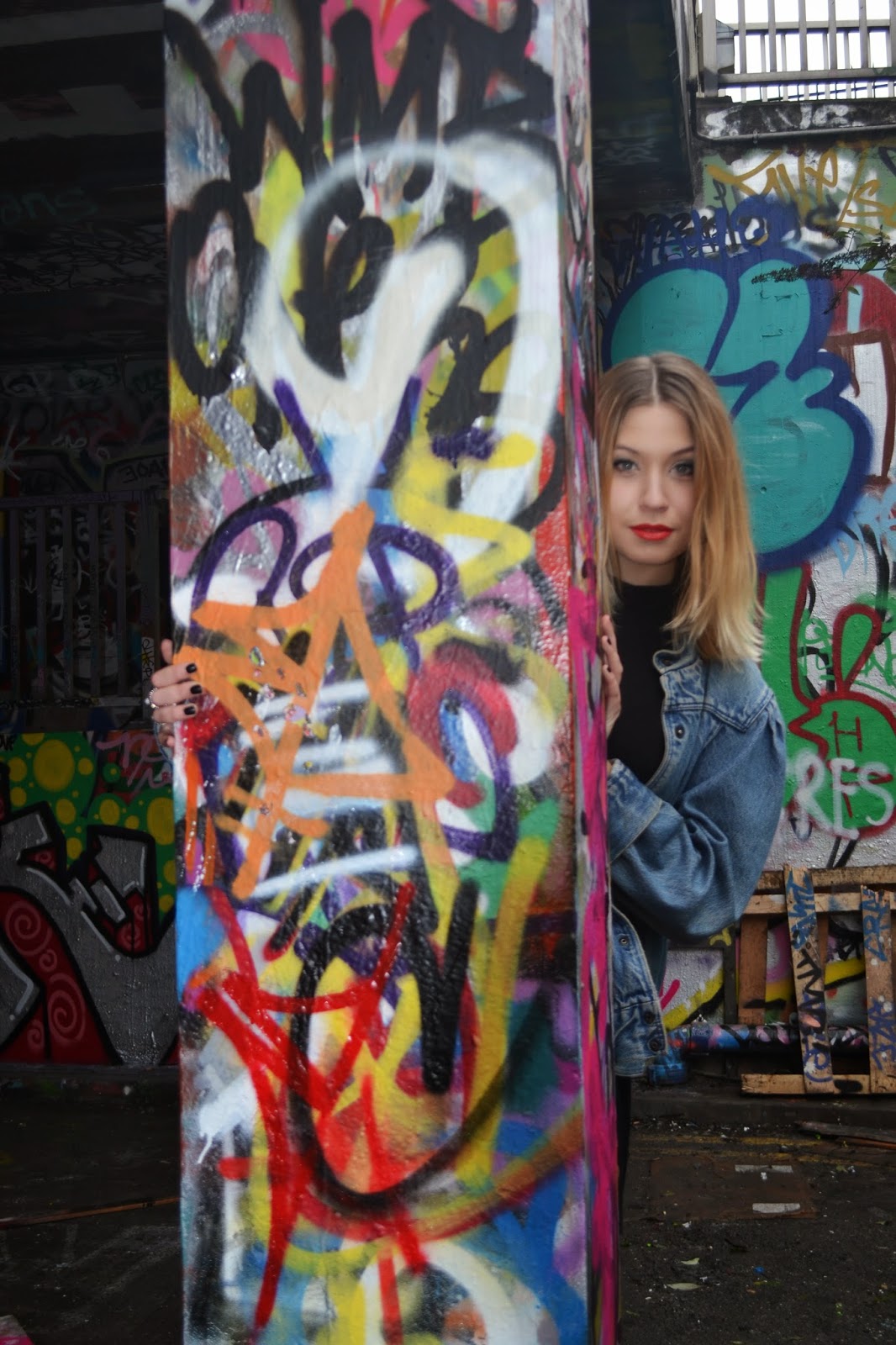
because our video is about being free and freedom in and around the urban location in London. I tried to create a feeling of being free whilst also trying to capture the urban feelings and surrounding around her. I didn't want to have to much of a set up when taking the photos as I feel this would come across as forced and prompted. I have tried to capture images where she looks more at ease and showing freedom by not looking so forced and fake in poses. I have used and thought about my composition when taking the photos to try and show as much as the urban scenes as I can within the photo without taking the focus off of Gabi. thinking about leading lines and rule of thirds has helped me still include the back ground of the image( showing the graffiti and urban locations) however not take the focus off of her. Still allowing her to be the main focus of the image.
Andrew Goodwins theory allows us to analyse music videos concentrating on 7 main principles:
Link between lyrics and visuals Links between music and visuals Genre characteristics intertextuality reference voyeurism star image Performance, iconography/artist image- visual style
He says that music videos are often constructed by the link between the visuals, lyrics and the music plus the artist. Relationships are built between these in the video, and the close-ups of the artists gives them the representation and publicity they require. Record labels demand artists to create a video which will sell records and Voyeurism is used to increase the video’s attractiveness, particularly to males, whilst intertextuality is often employed in humorous videos. Goodwin also says that a music video is ALWAYS one of the 3, performance, narrative or concept based videos.
‘Chocolate’ is a song by Indie-Rock band ‘The 1975′.
this music video indicates the conventions of an indie pop/rock band, this is recognised by the representation of the band and also from the sound of the instruments in the begging the sound of the guitar and drums signifies to us that it is a band. The video being in black and white and the location of it being underground and around the city at night signifies a rock genre.
In this song, the word ‘Chocolate’ is used an example of colloquialism as it is representing cannabis in a slang form. The artist has complied with Goodwin’s theory on this account as we see the lead singer of the band smoking ‘Chocolate’ as it is sung by him in the backing track, a clear link between lyrics and visuals in this music video. We see this on multiple occasions, showing how the artist has attempted to deliver a message to their audience not only of matty healys character but by combining their lyrics with the visuals of their music video. This is one of Goodwin’s six factors of a music video therefore showing how the artist has here complied with Goodwin’s theory. This can be seen below:
The video doesnt often cut to the beat, especially at the chorus, however we do focus on the lead singer and the rest of the band as it flashes to him and to the car. No solo instruments are played throughout the music video which would usually be done in atypical band music video.
Also, the music video contains many close-ups of both the lead singer, who has the main involvement in the song, but also the other members of the band. At times, as seen below, we see a mid-shot of all four band members at once, which then zooms in onto the lead singer’s face. Most record labels require an artist to include close-ups of themselves in a music video for promotion and publicity reasons. We again here see the artist complying with Goodwin’s theory due to the variety of close-up shots seen in the music video. This links in with the notion of looking as we very rarely see direct address from any of the four band members with the audience, giving a sense of voyeurism whilst still highlighting the band members and therefore aiding publicity.
We see the notion of looking with a sense of voyeurism in this music video, due to the sexualisation of both the male and female body. We get a feeling that we are watching the band members in the narrative of the video also due to the black-and-white effect which has been placed on a video, limiting how much we can see of the band members themselves. The artist here complies with Goodwin’s theory as they include sexualisation of both the male and female body, which is separate to the narrative and close to the camera. This is portrayed to the audience as a private situation, highlighting the sense of voyeurism which this music video replicates. Also, within the main narrative of the music video, we never see any of the band members make eye contact with the camera. We see the four band members sat in a car driving along what seems to be a quiet road and, as shown below, none of the four member make any connection with the camera situated at the front of the car. This again gives the notion of looking and a sense of voyeurism in the music video as it’s almost as if the band members are unaware that they are being watched and we therefore act as observers of the situation. This again complies with Goodwin’s theory as he stated that the notion of looking Is required in order to make a music video realistic and believable.
The music video includes genre characteristics in the form of the black-and-white filter which has been placed over the initial filming of the music video. This highlights their genre of Indie-Rock as this genre includes the idea of differentiation from ‘regular’ music videos, hence the black-and-white filter being different to most other music videos. Goodwin included genre characteristics in his six factors of music videos to allow the audience an insight into the genre of music which the artist primarily plays. Here, the artist has included one of the main characteristics of Indie-Rock in the form of differentiation, showing how they have complied to Goodwin’s theory and therefore stated their genre of music, attempting to attract a niche audience. This can be seen below:
The syncing 0f music and visuals is very limited in this music video, most likely due to the genre of the song and also therefore the genre conventions of the music video. We do see one occasion, where the lead singer and protagonist in this video is nodding his head along to the beat of the song. This complies with Goodwin’s theory as it conforms to his third factor of which a successful music video should contain. Below is a screenshot of the protagonist in mid-motion as he nods along to the beat in this music video:
Finally, Goodwin included in his theory that a music video should have some inter-textual references, whether that be to movies, books or other songs, through visuals or music. This music video includes no inter-textual referencing meaning that the artist is here not complying with Goodwin’s Theory. This could again be due to the genre of music which the artist is playing, but also the narrative of the video as the artist may feel it is intriguing enough for their niche target audience without having to include and intertextuality to aid the video’s success.
Overall, the 1975’s ‘Chocolate’ complies to five out of the six conventions which Goodwin set out in his theory. Goodwin’s theory has here been proved right as the video has over 14,000,000 views on YouTube alone, and the artist has also gone on to make other successful videos, such as ‘Robbers’ and ‘Settle Down’, which also most likely included many of the six factors listed in Goodwin’s theory.