Link to my website:
http://chennelmurray.wix.com/tomiofficial#!music/c17oo
Tuesday 31 March 2015
Monday 30 March 2015
DIGI PACK


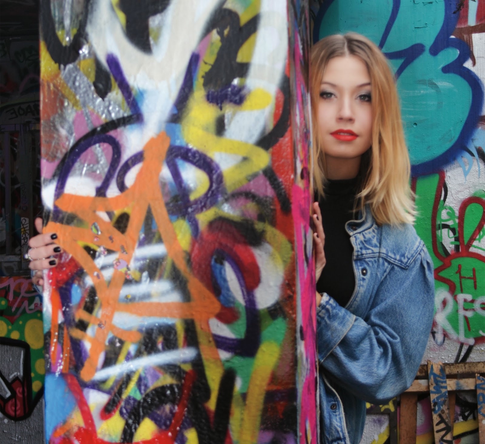
I have decided to have my images for the digipack close up as this allows the buyer to see the artists face. Along side this my digipack research also mainly had close up of the artists.


The is my front cover, I have decided to have a mid shot of Gabi with quite simple but interesting font this I thought would draw in a buy and fan with the artist wearing black and there being a contrasting back ground this allows the artist to stand out however allow the overall look to still be interesting. I have also added the parental advisory which then informs the buyer that there is songs on the album with explicit content.


For the back cover I have used the same idea as the front I have brightened and contrast the photo which has made the background stand out against Gabi who is again wearing all black. I have used the same front as the front cover for the tracking list but have made it in a smaller text. I have also added our group logo and the copyright message which is then adding copyright to the owner of the song and us.
This is my final digi pack I have decided to make mine brightly coloured and have chosen to stick with the urban look with the graffiti and urban shots of the star.
Sunday 29 March 2015
Friday 27 March 2015


Thursday 26 March 2015
Tour/festival page


I have decided to add a festival part to my tour page, I have done this as u believe that this is something our genre and artist would go to and show case her music. Also somewhere people in our target audience will be and attend
MERCH
I have decided to make merchandise for my website as all of the websites I have looked at have had merchandise. Because our genre is house I have decided to tone down the merch and not have it as much and not have it the main focus or promotion where as a genre like pop or a boy band will have.
I have decided to have a few tops and crop tops displaying our artists name across the front along side these I have made a jumper and a phone case. I chose todo these as I felt these are what the audience of this genre may buy.


Thursday 5 March 2015
Websites Jess Glynne
Content: combination of videos and photos, This showcases the star image to the viewer. when on the website and hovering over the individual videos they start to play this means that even of the viewer was not meant to click ion the video it will still play meaning the viewer will still see the video and make take in
trest and watch the full thing.


trest and watch the full thing.
the main things on the website are:
home- showing current news
Photos- connected to her Instagram and showing her photos from tour
Audio- her sound cloud is linked to this page
Video- her youtube is connected to this page showing music videos and interviews
Tour dates- tour dates and info on venues links to websites to buy tickets.
her websites puts forward her urban look and is showcased by Atlantic records. they have done this by linking her Instagram to her website this also gives the viewer and fans a feel of a connection between them and her. The website is updated regularly with news and current things going on. all of her music has been linked to the website this allows the fans to have acces to all the music she has done in one place. the website has a very current look and is very vibrent drawing in the viewer. i feel like the styles matches her target audience very well. The navigation of the website is very easy to use and everything works correctly connecting everything to each other.
Digi Pak Text
I have been online and have chosen a few different font i like the look of these are:


i have finally chosen to use this particular font as i find it works with the photots on my digi pak and works with the genre and the audience of our music video. i feel like this font is less boring and still clear to understand.
Wednesday 4 March 2015
Digipak Inspiration
Jessie Ware


The text on the album cover is placed underneath and above the main central image of the artist Using this placing is framing the image allowing the images to stand out and be the focus of the front cover. The artsists name and album title are shown on the front of the cover. the cd has the artist name in large text and the album name in a slightly smaller text. The tracking list are shown in a smaller text size around the outside of the disk, this isn't conventional however adds more interesting design to the album.
the main image on the cover of the album is mainly the artist this makes the audience and viewer focus on the artist. For this image they have used high key lighting especially on her face contrasting this they have used bold dramatic makeup which again makes us focus and drawn into looking at the artist. this look also gives jessie a more sophisticated look. her hair is also slick back which again then doesn't draw attention of her face. the whole image gives off a 60's style the black and white helps give tho effect. jessie is trying to convey a classic and sophisticated look through the imagery to suggest that she has carefully considered how she wants to be represented to the audience.
At the back of the cover they have used the same lettering and styles as the front cover. the artist album title are underneath each other and create a box shape. there is a white line underneath the album title and the tracking list this makes the design look simple to read and makes it also look professional. all the text and features on the back cover are yin whit this is makes it stand out in contrast to the black background.the typography on the cd is in the same styles and design as the rest of the album this shows a clear consistency making the digipak all match and look professional.
Tuesday 3 March 2015
digipak inspiration
Rhianna 'Loud' digipak

 Rhianna's front cover is definitely eye catching as the colours used are bold and compliment each other well, also they have used colours that are known to the public to be Rihanna and something we consider to link with her in this case is the colour red. Also the use of red links with the idea of passion and seductiveness which then links to the lyrics of her songs. the use of the red lipstick objectifies and portrays Rihanna as a sexual object, which then makes her subject to the male gaze. The image on the front is of Rhinna herself, the image covers the hole cover which makes us focus on her. Rihanna has not included her name on the front cover how ever the large colose up image and her persona allows her to not need to add her name to the cover


 The images are sexual and attract the male gaze as Rihanna is dressed in underwear and is showing a lot of skin. however she is dressed in white which connotes innocence and purity so it could demonstrate the difference in the music.
the back over links and uses the same pale pink this complements the theme of the inside cd. the track listing is in the same font as the 'loud' on the front cover this makes the album consistent.
The CD follows the floral theme which is first seen when opening the digipak in the backdrop behind the cd. This image is of Rhianna leaning across roses. The pale pink colours contrast with the red of the roses and Rihanna's hair and makeup which again signifies Rihanna as sexual and fierce hoiwever the pale pink shows a softer and gentle side to her and her music. The colours link with the front cover of the album.
The images are sexual and attract the male gaze as Rihanna is dressed in underwear and is showing a lot of skin. however she is dressed in white which connotes innocence and purity so it could demonstrate the difference in the music. the back over links and uses the same pale pink this complements the theme of the inside cd. the track listing is in the same font as the 'loud' on the front cover this makes the album consistent.
The writing in this part of the digipak is done by rhianna herself, here she is explaining what each song is about and what is means to her and who she has written the song for.
Monday 2 March 2015
Digipak Anaylsis
Jess Glynne

 Jess Glynne is known for her deep house songs with gorgon city and clean bandit. Her image is seen to be garage, cool and vintage. This image is then also shown within her album art to create continuity with her and her albums and sales.
Her album cover for 'Hold my Hand'
The main focus of this album cover is her, the main image on the cover of the album is her therefore this is all we focus on when looking at the cover of the album. The picture highlights the style she has and is linked with the music video that is on the album. her makeup and costume shown and used in the album cover also ties and links in with the eye makeup and vibrate colour of both her hair and top in the music videos. The bold central text on the front of the album cover to show both her name and the album cover name.
For her album cover for 'Home', it follows a more of a representation of a dance/house music.
the use of vibrant colours and the inverted colours shows the connection with what we link with house music. . It also has sexual connotations, another aspect of dance album covers. also similar to the home cover she has used simplistic bold font used for the artist and album name.
I will be using this as inspiration for my own album cover. I like the inverted colours and I feel this links well with the genre of house music. I will most likely have an image of the star as the front cover as a main feature showing the artist, I will then also use more photos on the inside pockets of the digipack experimenting with other close up images of my artist.
Subscribe to:
Posts (Atom)